Bugs found in ZephAir for iOS
ZephAir is a mobile app that determines air quality in 70 locations around the world. It features non-US areas, except for Washington, DC. The app is developed by the US Department of State and its government partners, and it displays all the data in real time. As for the core features, ZephAir allows its users to select preferred locations to see the most relevant data first. You can also enable notifications if you want to instantly receive updates on those locations that matter to you most. Since air quality is one of the core factors affecting our health, ZephAir creators made sure the app users can stay safe. Therefore, they provided recommendations on how to protect one’s health using the Environmental Protection Agency Air Quality Index. Lastly, ZephAir’s users can also access some historical data, such as air quality reports for the last 24 hours or two weeks. The ZephAir team continues working on the app, so if you haven’t found your location in the list, make sure to check after a while.
We regularly participate in eco-initiatives; therefore, we highly support organizations that share the same values. ZephAir is one way to draw attention to what is happening with the quality of air worldwide. We manually tested the app to make sure there are no ZephAir bugs that may scare off potential users.
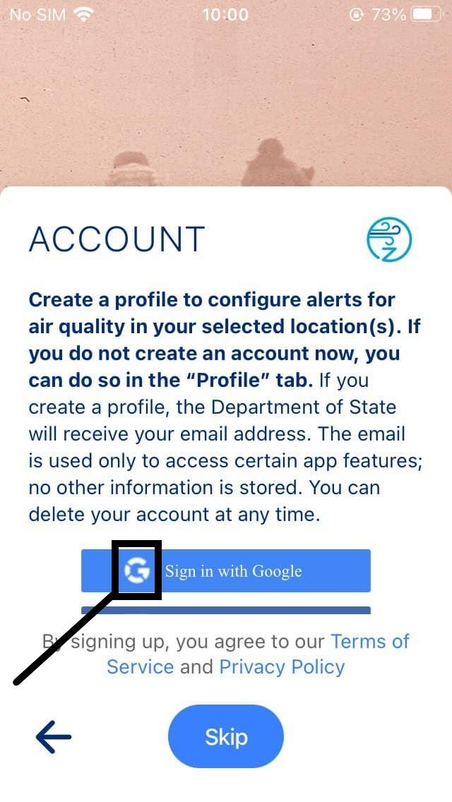
The “Google” icon within the “Sign in with Google” button isn’t colorful
Minor
- Launch the app.
- Tap “Reload” on the initial screen.
- In the “Welcome” block, tap “Next”.
- In the “Account” block, take a look at the icon of “Google”.
- Pay attention to the next result.
iPhone SE 1st gen + iOS 14.2
The “Google” icon within the “Sign in with Google” button isn’t colorful.
The “Google” icon within the “Sign in with Google” button contains Google’s brand colors (red, yellow, green, blue).
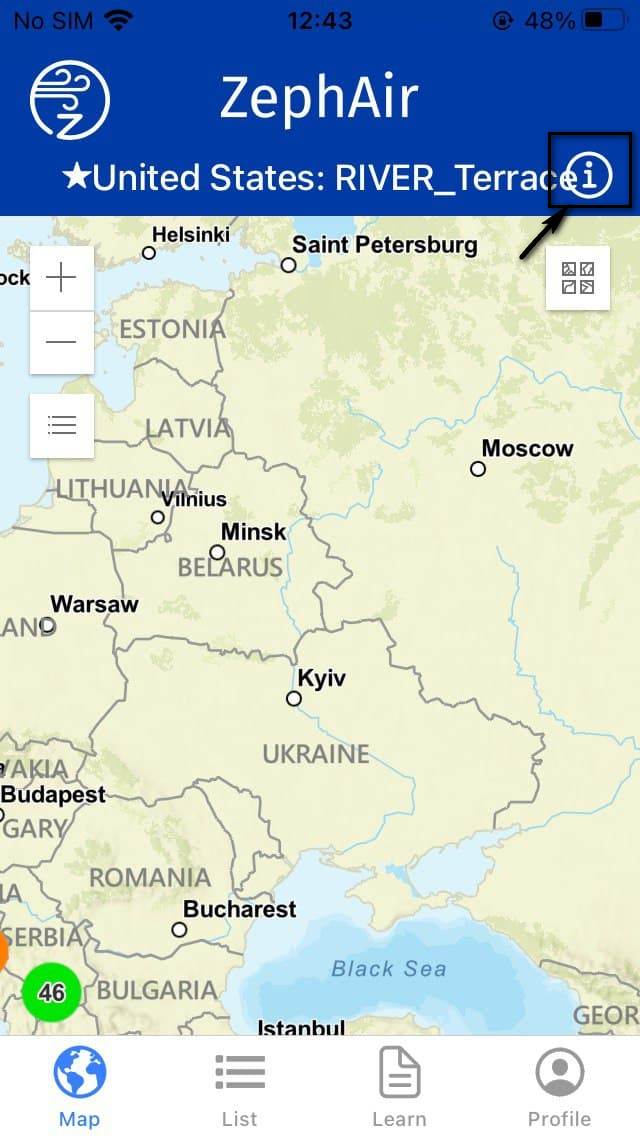
The information icon on the map screen slightly overlaps the title “United States: River_terrace”
Minor
- Launch the app.
- Tap “Reload” on the initial screen.
- In the “Welcome” block, tap “Next”.
- Tap “Sign in with Google” button and log in with an existing account.
- In the “Set notifications”, tap “Next”.
- In the “AQ Details”, tap “Next”.
- Tap the “Profile” tab.
- Tap “Locations”.
- Set “United States: Northeast, Washington D.C” as Primary Location by tapping it (Mexico: Mexico City was default location).
- Confirm switching the primary location by tapping the “Save” button within the appeared “Primary Location” block.
- Tap “Map” at the bottom of the screen.
- Pay attention to the “Informational icon”.
iPhone SE 1st gen + iOS 14.2
The information icon on the map screen overlaps the title “United States: River_terrace”.
The information icon doesn’t overlap anything.
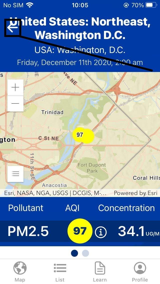
The left-arrow pointer slightly overlaps the location title on the app’s main page
Minor
- Launch the app.
- Tap “Reload” on the initial screen.
- In the “Welcome” block, tap “Next”.
- Tap “Sign in with Google” and log in with an existing account.
- In the “Set notifications”, tap “Next”.
- In the “AQ Details”, tap “Next”.
- Make sure that “Primary Location” is “United States: Northeast, Washington D.C” (This location was set up earlier in the previous bug report).
- Pay attention to the next result.
iPhone SE 1st gen + iOS 14.2
The left-arrow pointer slightly overlaps the location title on the app’s main page.
The left-arrow pointer does not overlap the location title on the app’s main page.
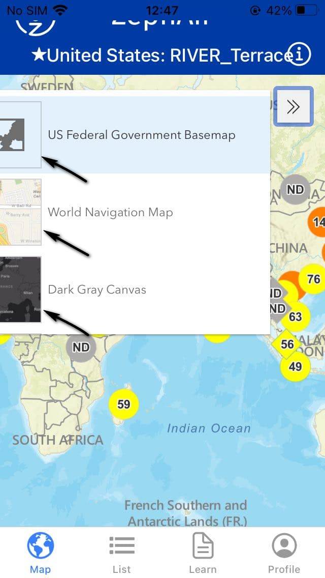
Images of “US Federal Government Basemap”, “World Navigation Map”, and “Dark Gray Canvas” are only partially visible
Trivial
- Launch the app.
- Tap “Reload” on the initial screen.
- In the “Welcome” block, tap “Next”.
- Tap “Sign in with Google” and log in with an existing account.
- In the “Set notifications”, tap “Next”.
- In the “AQ Details”, tap “Next”.
- In the footer of the screen, tap “Map”.
- Tap “double right-narrow” in the upper-right corner of the map.
- Pay attention to the next result.
iPhone SE 1st gen + iOS 14.2
The collapsible menu opens images of “US Federal Government Basemap”, “World Navigation Map”, and “Dark Gray Canvas”; however, they are only partially visible.
The collapsible menu opens images of “US Federal Government Basemap”, “World Navigation Map”, and “Dark Gray Canvas”, and they are displayed without any visual defects.
ZephAir is a handy app for anyone interested in air quality, be it their home town or a distant area. The app shows real-time data from 70 locations worldwide. Although I support the app's concept, I wish it was optimized for all the screen sizes. It would definitely help eliminate the UI issues I faced, such as icons and arrows overlapping text as well as cropped images.

