Bugs found in Zario: Reduce Screen Time for Android
Zario is an award-winning app revolutionizing digital habits. Recognized as the “#1 App of the Day” on Product Hunt, Zario isn’t just an app — it’s a science-driven solution for reclaiming your time in the digital era.
With a focus on digital wellbeing, Zario empowers users to laser in on tasks, remold habits, and stay present, all while boosting productivity and tranquility. Backed by real research and proven therapies like CBT and ACT, Zario is more than a productivity tool — it’s a lifestyle shift toward intentional and meaningful tech use.
Our QA engineers conducted a thorough QA test of the Zario app, and here are the results of our work.
Text within information window appears cropped
Minor
- The application has been installed.
- The application has already been opened and used by the user.
- The user does not have a paid subscription.
- Open the application.
- Tap on the “Challenges” button.
- Tap on the “Book” icon located in the upper right corner.
- Tap on the “Question mark” icon, also located in the upper right corner.
Android 13, Galaxy A71
The text within the information window is cropped and unreadable.
The text should be fully visible and legible.
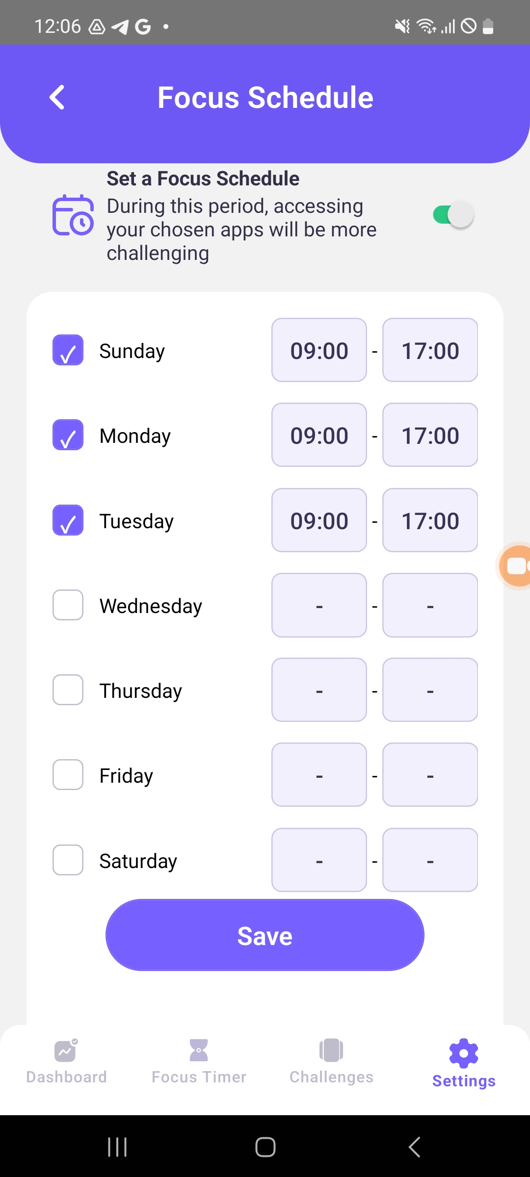
Misaligned mark within box
Minor
- The application has been installed.
- The user has already opened and used the application.
- The user does not have a paid subscription.
- Open the application.
- Tap on the “Settings” button.
- Tap on the “Distracting App Settings” button.
- Tap on the “Focus Schedule” button.
- Tap on the checkbox for three days.
Android 13, Galaxy A71
The mark is positioned at the bottom of the box.
The mark should be centrally aligned within the box.
“I Have a Promo Code” button appears cropped
Minor
- The application has been installed.
- The user has launched and used the application before.
- The user does not have a paid subscription.
- Open the app.
- Tap on the “Settings” button.
- Tap on the “Try 7 Days for Free” button.
- Scroll down to the bottom of the screen.
Android 13, Galaxy A71
The “I have a promo code” button appears cropped.
All elements of the screen should be properly visible.
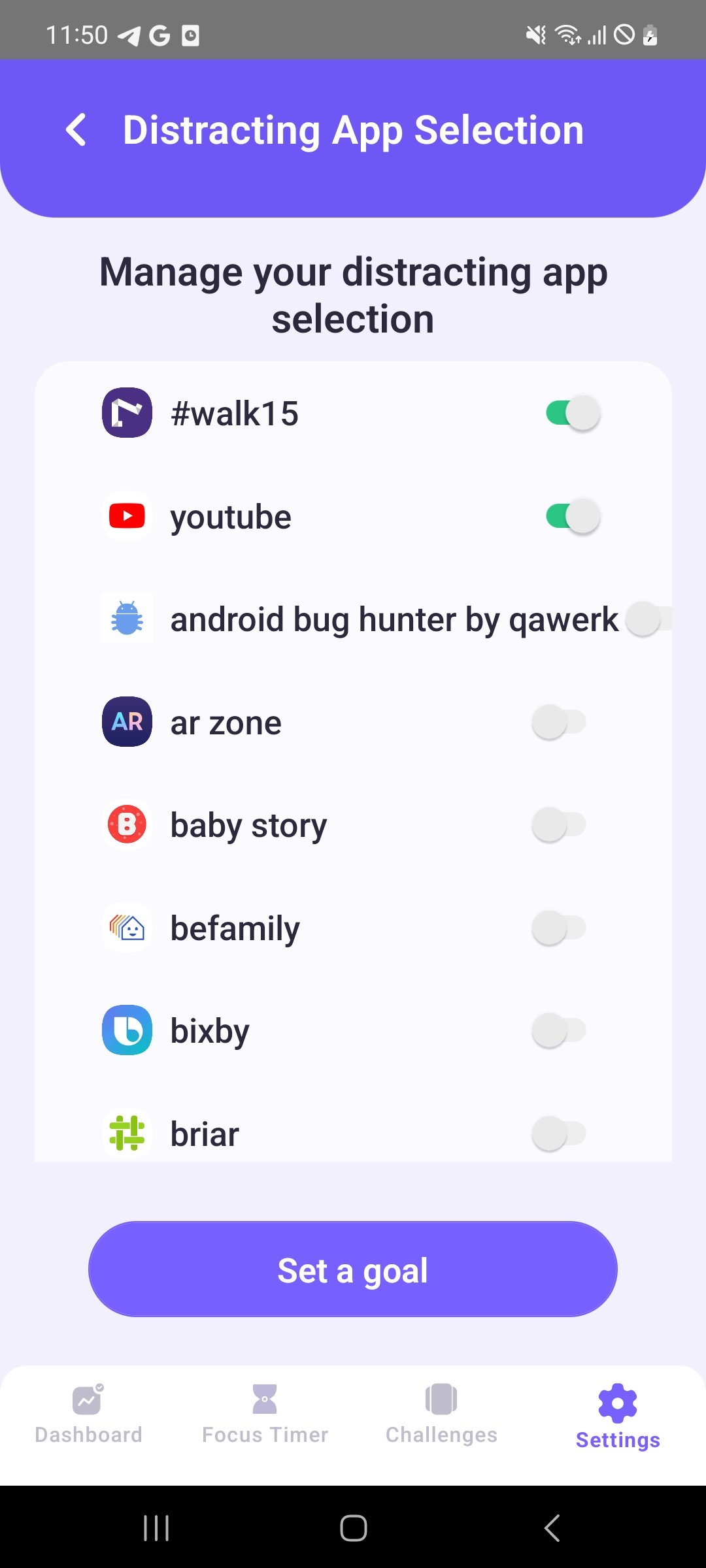
App clock extends beyond allotted area
Minor
- The application has been installed.
- The user has previously opened and utilized the application.
- The user does not have a paid subscription.
- Open the application.
- Tap on the “Settings” button.
- Select the “Distracting App Settings” option.
- Click on the “Manage Distracting Apps” button.
Android 13, Galaxy A71
The block containing the app information extends beyond the designated area. This makes the on/off switch appear chopped off.
An app with a name exceeding 25 characters should be abbreviated with an ellipsis (e.g., …).
Overall, my impression of the application is positive since it operates stably without any major issues. However, during the testing process, I've come across a few minor bugs.


