Bugs found in GitHub for Android
GitHub for Android is a version control tool for software development teams to stay connected and work in sync no matter where their team members are. The app allows users to perform actions that do not require a complex development environment, such as browsing through notifications, checking and responding to issues and pull requests, reviewing and merging pull requests, as well as neatly organizing their issues with labels, assignees, and projects.
As someone who uses GitHub daily, we wondered if its mobile solution is as good as its web counterpart. Here are some GitHub for Android bugs we spotted while testing.
The project’s status is not marked as starred after the user has updated it
Major
- Open the app.
- Tap the “Explore” button.
- Select any project.
- Tap the “Star” button.
- Navigate to the “Explore” page again.
Huawei Nexus 6P + Android 8.0.0
The project’s status is the same; it is not marked as starred.
The project’s status is updated.
The text color on the “Dark Theme” pop-up is not changed to white after selecting the dark mode
Trivial
- Open the app.
- Tap the “Profile” > “Settings” icon.
- Tap the “Theme” variant.
- Select “Dark” mode.
Huawei Nexus 6P + Android 8.0.0
The text color is black.
In terms of usability, the text should be of a contrasting color, such as white.
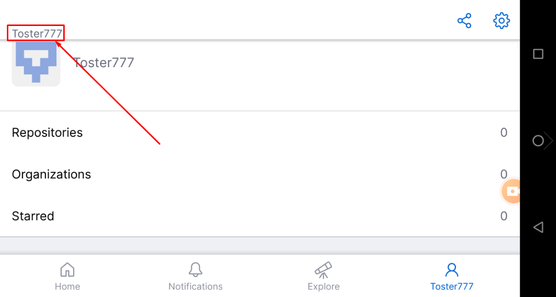
The user’s nickname is displayed twice on the “Profile” page when the app’s orientation changed to landscape
Trivial
- Open the app.
- Tap the “Profile” button.
- Change the orientation to landscape.
- Scroll the page to the bottom.
Huawei Nexus 6P + Android 8.0.0
The user’s nickname is displayed twice.
The user’s nickname is displayed once.

GitHub for Android is a handy tool for professionals familiar with the Git workflow. I appreciate the opportunity to access my projects while miles away from my laptop, review pull requests, and quickly respond to them on-the-go. I haven’t found any major issues apart from the bug with marking projects as starred and a couple of minor UI inaccuracies.


