Bugs found in Zembula SaaS

Zembula is an AI-powered SaaS platform designed for launching successful marketing campaigns. It works with any email service provider or a marketing cloud, and you can also integrate it with any of your data sources. What’s great about Zembula is that it allows marketers with zero coding skills to create competitive and engaging campaigns: all they need to do is to paste a code snippet into their email templates. One of its distinctive features is that the email content updates in real time, the moment the user opens it. What’s more, Zembula uses AI to determine best-converting emails or notifications faster than traditional A/B testing, and you can also test multiple variants simultaneously. With Zembula’s visual editor, marketers can easily customize each email block and even convert an entire webpage into an email. The most exciting part of the Zembula platform is its interactive media experiences, such as Scratch-it, Tap-it, Peel-it, Shake-it, Slide-it, Trace-it, and Explode-it, that entertain users and at the same time prompt them to act immediately.
Since we’ve been working with AI-powered SaaS products before, we are interested in similar solutions, and Zembula happened to be right in our sight. As usual, we started with exploring the website because a polished website oftentimes equals a polished product. So here are some Zembula bugs we spotted while browsing.
“Shop now” button doesn’t work and the server sends back the 204 response.
Major
- On zembula.com set the cursor on the “Product” tab.
- Click on the “Product tour” option.
- Scroll down to “Use Zembula For More Than Just Live Images”.
- Click on “Learn More” near “Interactive content”.
- Scroll down to “Pick From a Library of…” and click on “And more”.
- Find “The best brew in town” and Tear-it.
- Click on “Shop now”.
MacBook Pro 15”
macOS Big Sur 11.1
Google Chrome
Nothing happened after the click. The server sends back the 204 response.
The user is redirected to another page where they can either read more, sign up, or purchase something.
Email inputs are cropped
Minor
- On zembula.com, scroll down to the “Explore the platform” button and click on it.
- Set the cursor to “Download ou preview…” input.
- Type an email.
MacBook Pro 15”
macOS Big Sur 11.1
Google Chrome
Not the whole input is available for typing text. The email is only partially visible.
The input field allows typing and seeing the full email address.
Likes in “Blog” are not saved after the page reloading
Minor
- On zembula.com set the cursor on the “Resources” tab.
- Choose “Blog” from the dropdown.
- Open any article and click on the heart inside it.
- Reload the page.
MacBook Pro 15”
macOS Big Sur 11.1
Google Chrome
The heart counter wasn’t updated. The heart icon becomes grey.
The counter shows +1 once the user clicks on it. The icon stays red even after the page is reloaded.
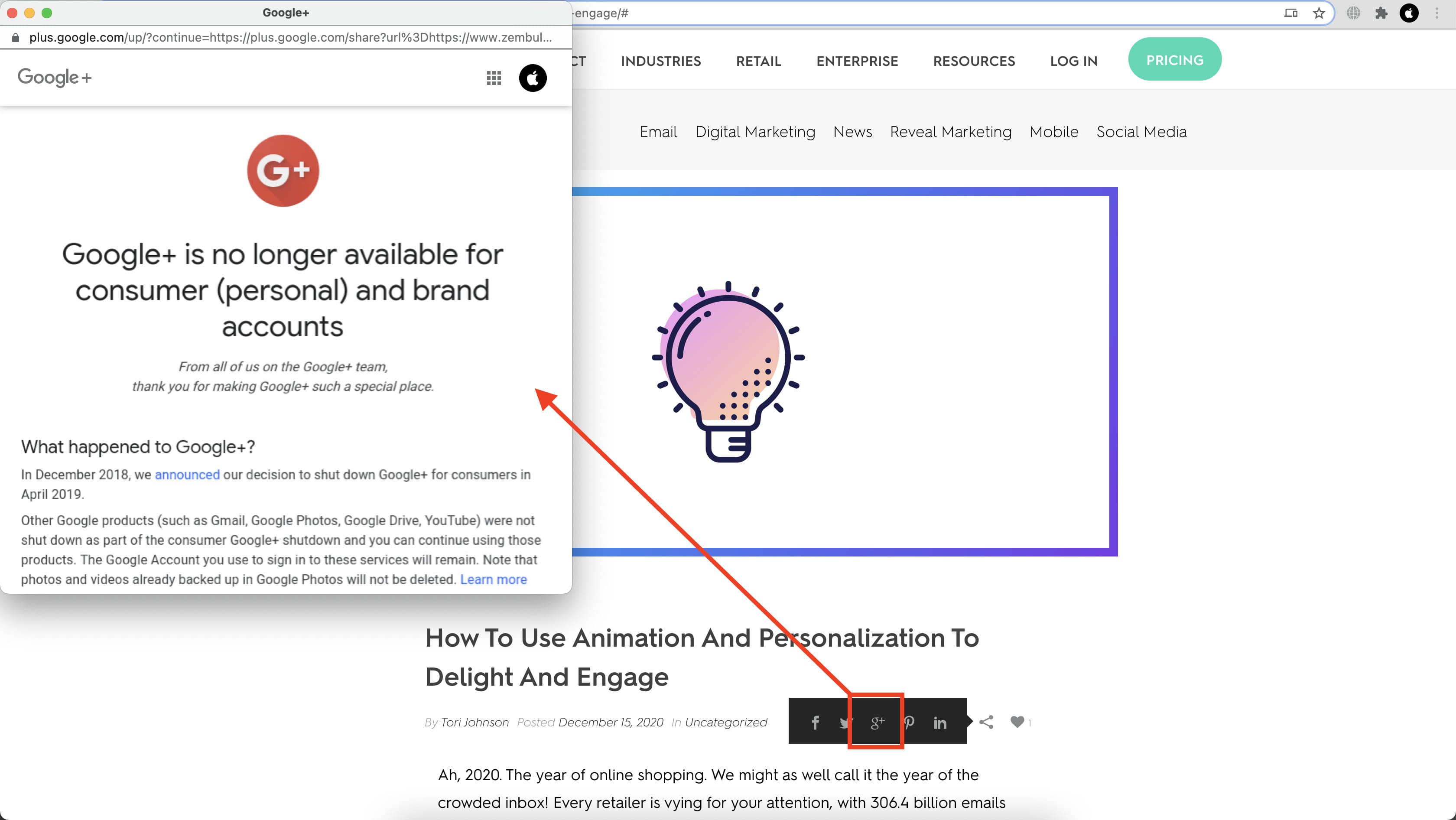
Unavailable Google+ is still displayed in the sharing options
Minor
- On zembula.com set the cursor on the “Resources” tab.
- Choose “Blog” from the dropdown.
- Open any article and click on the sharing icon.
- Click on the G+ icon.
MacBook Pro 15”
macOS Big Sur 11.1
Google Chrome
The user is redirected to a page with information that Google+ is no longer available.
The user doesn’t see G+ among the sharing options.
“Visit our blog” redirects to “Pricing”
Minor
- On zembula.com set the cursor on the “Product” tab.
- Click on the “Product tour” option.
- Scroll down to “Use Zembula For More Than Just Live Images”.
- Click on “Learn More” near “Interactive content”.
- Scroll down to “Pick From a Library of…” and click on “And more”.
- Find “It’s frosty outside” and Zip-it.
- Click on “Visit our blog”.
MacBook Pro 15”
macOS Big Sur 11.1
Google Chrome
The user is redirected to “Pricing.”
The user is redirected to “Blog.”
“Schedule a demo” redirects the user to to the top of the page
Minor
- On zembula.com set the cursor on “Product” and click on “Optimization”.
- Scroll down to “How Does Zembula’s AI Work?” and click on “Schedule a demo”.
- Observe the next result.
MacBook Pro 15”
macOS Big Sur 11.1
Google Chrome
The user is redirected to the top of the page and there is no form to schedule a demo.
The user is redirected to the “Schedule a demo” form.
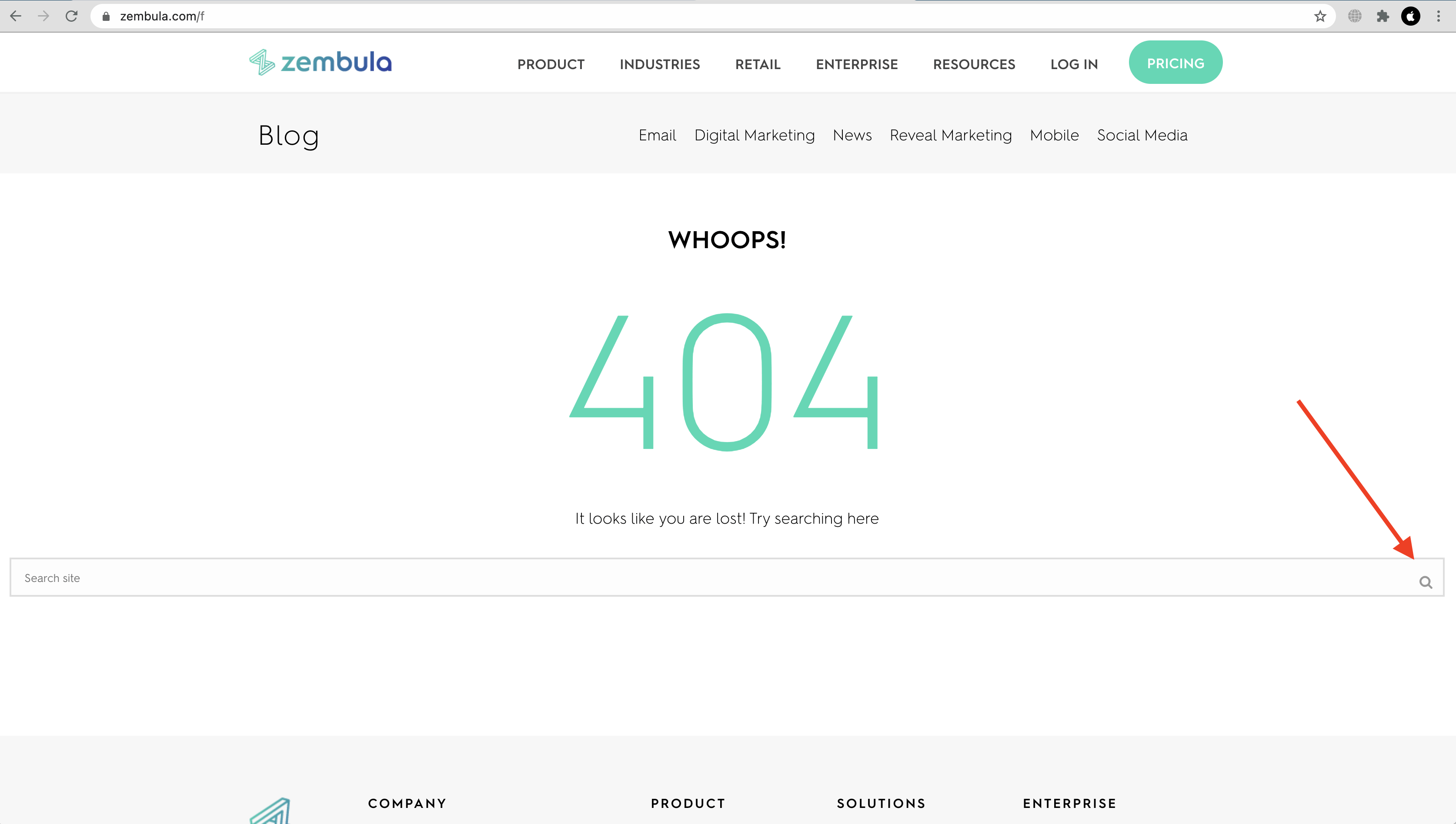
The search icon is not centered
Minor
- On zembula.com change the route to any (to get 404 page).
- Check the search input and its icon.
MacBook Pro 15”
macOS Big Sur 11.1
Google Chrome
The search icon is not centered.
The search icon is properly aligned.
Zembula is an excellent service for creating engaging email content in an effortless way. Its AI learns from your audience and updates the content in real time to help you personalize your messages and display only relevant product offerings. While browsing through the web platform, I found some issues with inputs, sharing options, and incorrect redirections. Although minor, inaccuracies here and there do affect the overall image of the Zembula brand.

