Bugs found in Planisware SaaS: QAwerk Bug Crawl

Planisware is a software provider with 25 years of experience that has rounded off 2020 with M$105 revenues. The company offers PPM tools that are easy to use and deploy. Planisware supports the following functional areas: project and program management (cost, resource, planning, suppliers), project portfolio management, idea management, business intelligence, collaboration, and time tracking. Planisware Enterprise and Planisware Orchestra are the company’s two key project & portfolio management solutions. Planisware Enterprise is a strategic portfolio management tool that allows for proper budget prioritizing, consolidating milestones and deliverables across the company, ensuring alignment between projects and strategy, and defining objectives and supporting activities. With Planisware Orchestra, the users will see adaptive project management at its best.
At QAwerk, we have tested quite a list of tools for high-level planning. We advocate for top-notch management solutions. Thus, this software that helps plan projects and resources caught our attention. Our verdict is that it is a powerful, robust, and highly configurable solution that brings its users all the necessary features, unfortunately, along with a few UI/UX drawbacks. Read on for more details on Planisware bugs.
The tip does not pop-up when the user hovers the mouse over it
Major
- Go to https://www.planisware.com/.
- Hover the mouse over the ‘Customers’ button in the menu bar.
- Click on ‘Life Sciences’ in the dropdown menu.
- Scroll down to see ‘Planisware capabilities frequently deployed include:’ option.
- Hover mouse over the third point ‘resource capacity planning and resource management’ to see the tip.
- The tip does not pop-up.
- Click on the option to see the tip.
- Given that ‘resource capacity planning and resource management’ is link text, the new page opens, and there is no way to read the tip.
Windows 10 Pro +
Chrome v. 87.0.4280.88
The tip does not pop-up when the user hovers the mouse over the link text.
The tips pop-up when the user hovers the mouse over the link text.
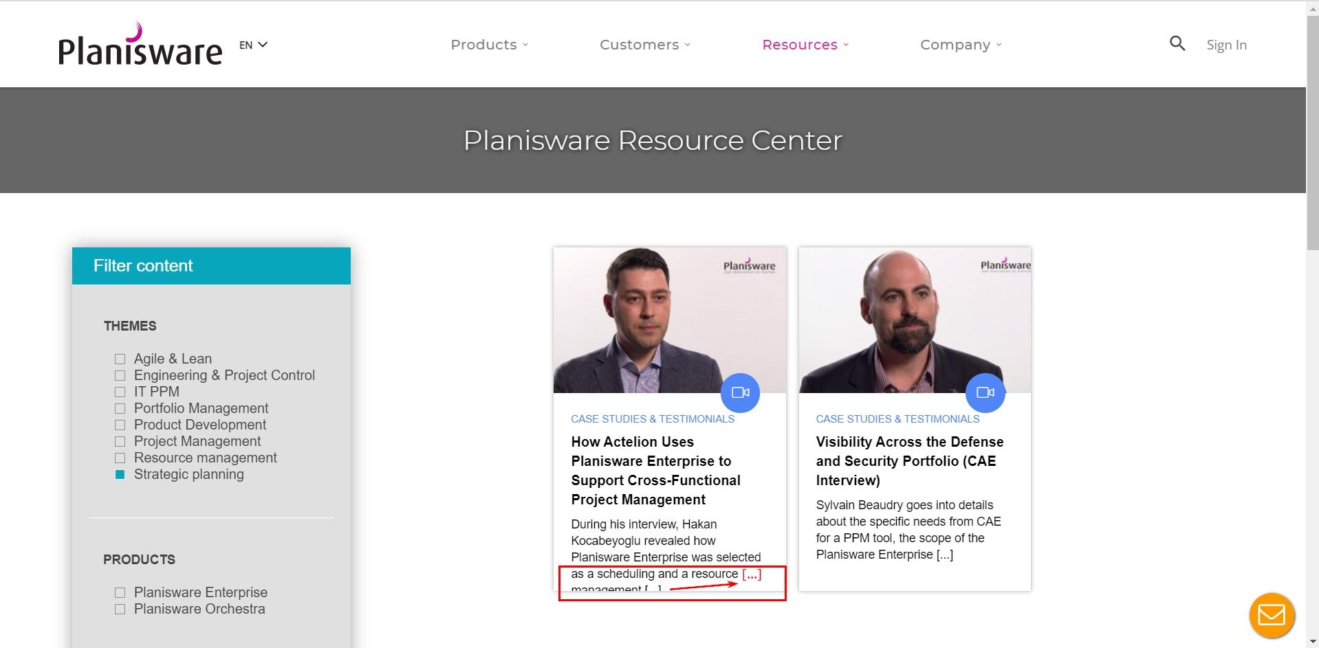
The text in the description box is cut off
Minor
- Go to https://www.planisware.com/.
- Scroll down to the bottom of the page.
- Click on the ‘Resource Center’ in the Products column.
- Filter the content by the theme ‘Strategic planning’ and the document type ‘Case Studies & Testimonials’.
- Click on the ‘Apply filters’.
- Observe that the text is cut off improperly in the first description box.
Windows 10 Pro +
Chrome v. 87.0.4280.88
The text in the description box is cut off.
The text is properly displayed.
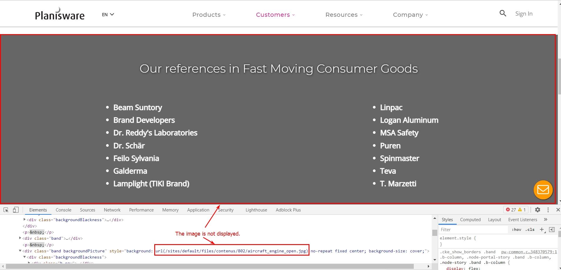
The 'Our references in Fast Moving Consumer Goods' banner is not displayed.
Minor
- Go to https://www.planisware.com/.
- Hover the mouse over the ‘Customers’ button in the menu bar.
- Click on the ‘Fast Moving Goods’ option in the dropdown menu.
- Scroll down to the second banner.
- Observe the grey blank banner.
Windows 10 Pro +
Chrome v. 87.0.4280.88
The ‘Our references in Fast Moving Consumer Goods’ banner is not displayed.
The ‘Our references in Fast Moving Consumer Goods’ banner is displayed.
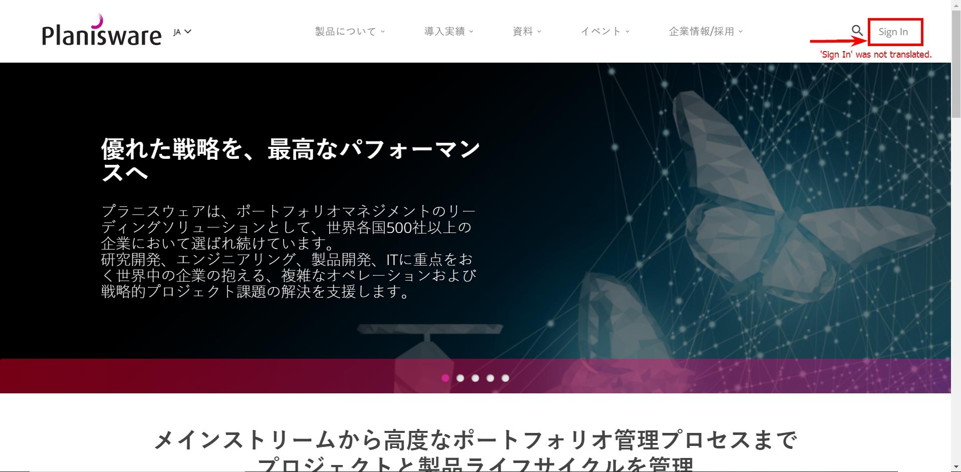
The 'Sign In' button is not translated to Japanese in the Japanese website version.
Minor
- Go to https://www.planisware.com/.
- Click on ‘∨’ image in the header to change the language.
- In the dropdown menu change the language to Japanese.
- Observe the Japanese version of the page.
Windows 10 Pro +
Chrome v. 87.0.4280.88
The ‘Sign In’ button is not translated in the Japanese website version.
All the elements are translated accordingly.
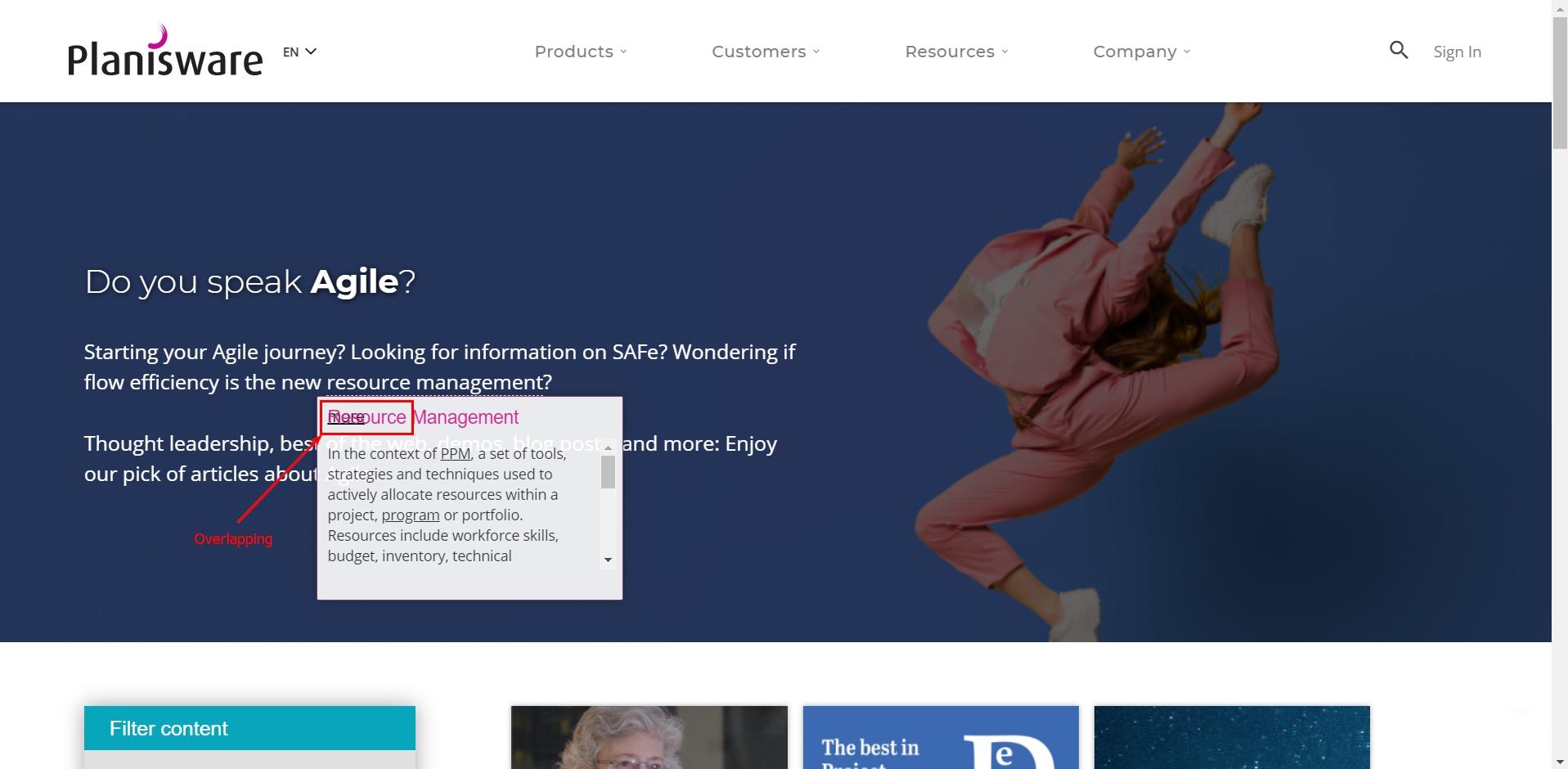
Several UI elements overlap
Minor
- Go to https://www.planisware.com/.
- On the first banner ‘Do you speak agile?’ click on the ‘Explore more’.
- Hover the mouse over the ‘resource management’ and click on it.
- Observe the tip.
Windows 10 Pro +
Chrome v. 87.0.4280.88
Some UI elements overlap.
All the elements are properly displayed.
Planisware is a project portfolio management toolbox. The navigation is intuitively understandable and nice, yet I’ve found several defects while navigating the website: the tips that don’t pop up, cut off texts, and misdisplayed banners. These shortcomings do not affect the main functionality but still ask to be fixed.

