Bugs found in Mailmunch SaaS: QAwerk Bug Crawl

Mailmunch is a marketing toolkit for everyone who wishes to generate more leads and grow revenue through email marketing. This handy solution allows converting more users into customers. Mailmunch uses an intuitive drag-and-drop builder, which does not require any coding skills to set up, so it only takes a few minutes to create, for example, a professional-looking opt-in form. With Mailmunch, users can grow email subscribers by building email lists with higher efficiency, craft broadcasts to widen the audience, and generate more sales with autoresponders that are incredibly easy to set up.
A 60-day money-back guarantee is available with paid plans so that users can try out the pro features with no strings attached.
Here are some of the bugs we found while testing the website.
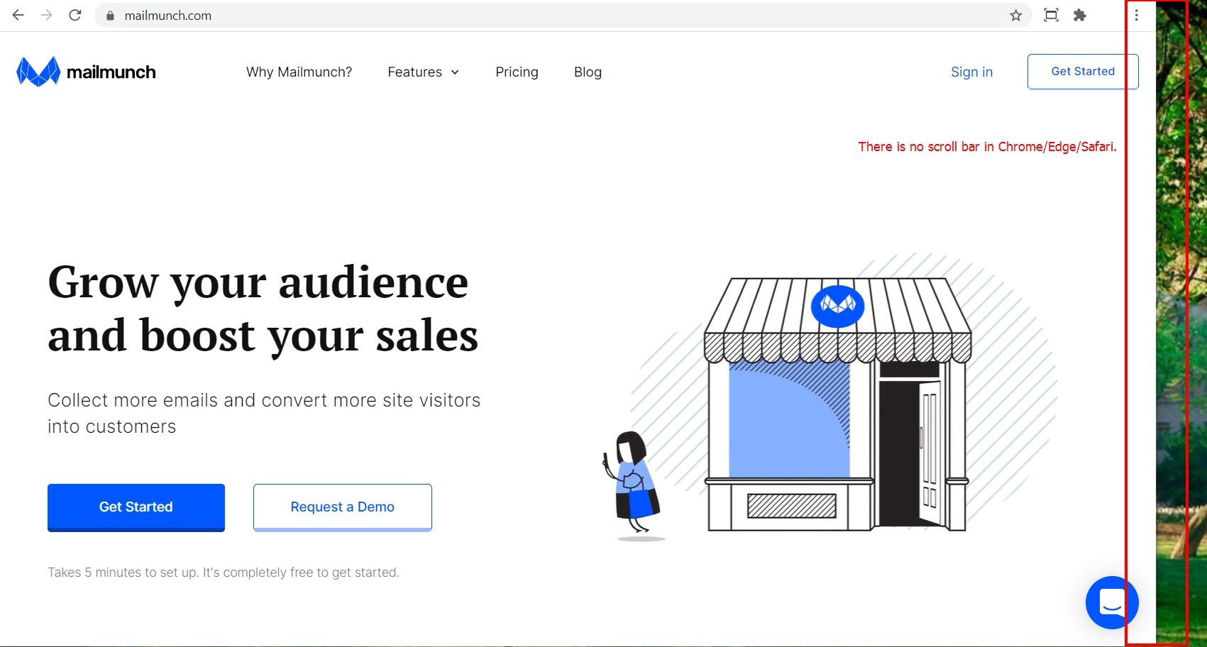
The scroll bar on the right-hand side of the screen is missing
Major
- Go to https://www.mailmunch.com/ page.
- Observe the right-hand side of the screen.
Windows 10 Pro +
Chrome v. 87.0.4280.88,
Edge v. 87.0.664.75;
macOS Mojave 10.14.6 +
Safari v. 14.0.2.
The scroll bar is missing.
There is a scroll bar on the right-hand side of the screen.
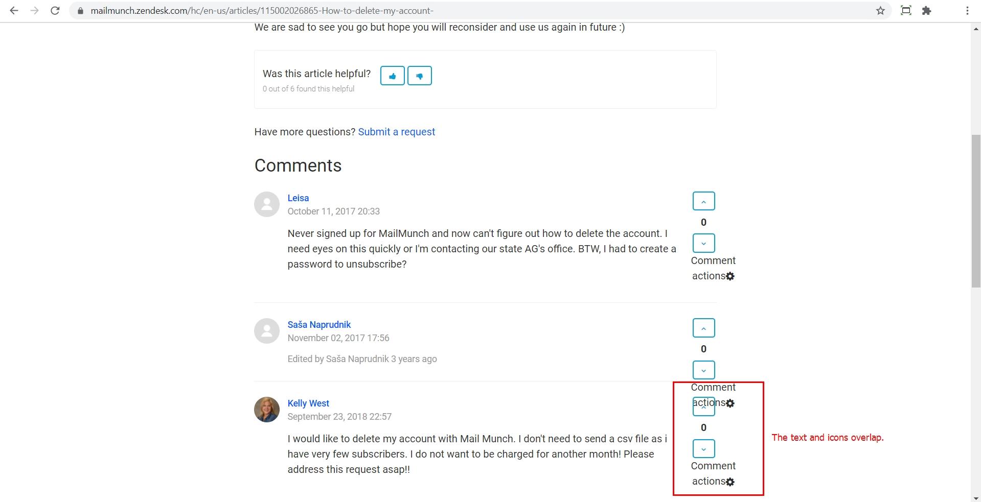
The text and icons in the comments to the support answers overlap
Minor
The user is logged in.
- Open one of the support answers on https://mailmunch.zendesk.com/hc/en-us/articles/115002026865-How-to-delete-my-account-.
- Scroll down to the comments.
- Observe the text overlapped by the icons.
Windows 10 Pro +
Chrome v. 87.0.4280.88
The text and icons in the comments to the support answers overlap
The text and icons in the comments to the support answers do not overlap.
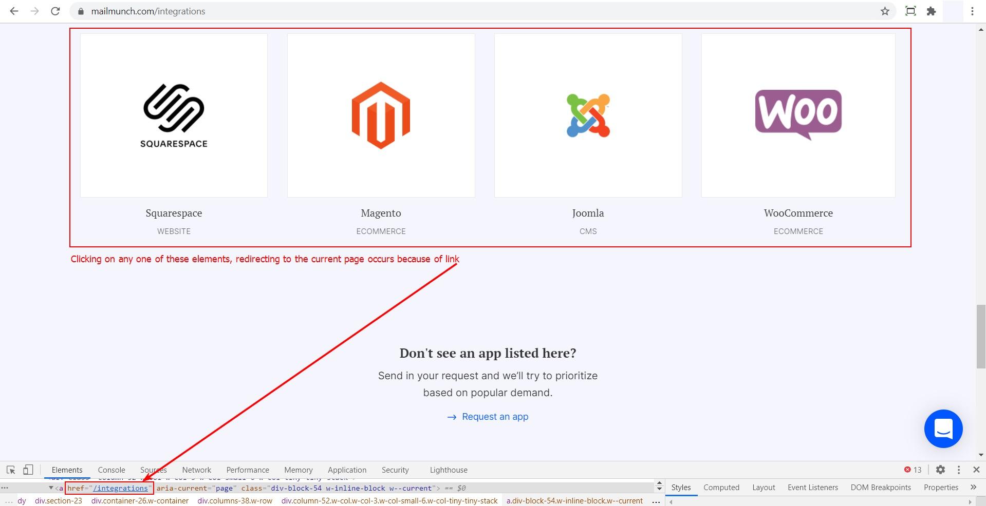
Some UI elements do not redirect to the corresponding page in the Integrations Directory
Minor
- Go to https://www.mailmunch.com/.
- Scroll down to the bottom of the page.
- Click on the “Integrations Directory” option in the “Community” table.
- Scroll down to the “Website and eCommerce Platforms” block.
- Click on any of the following options: Squarespace/Magento/Joomla/WooCommerce.
- Observe the current page.
Windows 10 Pro +
Chrome v. 87.0.4280.88
The user is not redirected to the corresponding page in the Integrations Directory.
The user is redirected to the corresponding page in the Integrations Directory.
The error message is displayed in Spanish (an English-only platform)
Trivial
The user is logged in.
- Open https://www.mailmunch.com/ and log into the account.
- Click on the “Company” block.
- In the “Add Site Code” block, click on the “Get Code” button.
- In the opened pop-up, enter an incorrect URL in the “Input URL to verify” form > click on the “Verify code” button.
- Observe the results.
Windows 10 Pro +
Chrome v. 87.0.4280.88
Upon incorrect URL input, the error message is displayed in Spanish.
Upon incorrect URL input, the error message is displayed in English.
The "Like" and "Tweet" buttons are misaligned on the "Blog" page
Trivial
- Go to https://www.mailmunch.com/.
- Click on “Blog” in the menu bar.
- Scroll down to the bottom of the page.
- Observe the “Like” and “Tweet” buttons’ placement.
Windows 10 Pro +
Chrome v. 87.0.4280.88
The “Like” and “Tweet” buttons are misaligned.
The “Like” and “Tweet” buttons are properly aligned.
Mailmunch is a good product that solves actual problems. Yet, I came across some UI problems while browsing through the website, such as the absence or misalignment of UI elements. The issues I found are not severe but still require timely fixing.


