Bugs found in EdApp for iOS
EdApp is a mobile learning management system built to make corporate learning smarter and more fun.
The app allows creating an unlimited number of courses for an unlimited number of users with the option to add your own branding. Better learners’ engagement is achieved through bite-sized lessons reinforced with quizzes and games.
As a mobile testing company with a track record in e-learning, QAwerk could not pass by an innovative solution like EdApp. Our QA engineers made a quick test run, and here is how we believe the app can be improved.
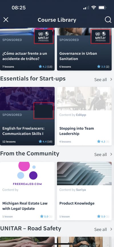
Sponsor logo not showing
Minor
- Open the app.
- Go to “Courses”.
- Tap the “+” button.
- Scroll down to “Unitar – Road Safety”.
- Scroll the carousel.
iPhone 13, iOS 15.4.1
The sponsor logo is not displayed.
The sponsor logo is displayed.
Course title and description are hard to see
Minor
- Open the app.
- Go to “Courses”.
- Tap the “+” button.
- Find the course “Residential vs. Commercial”.
- Open the course.
iPhone 13, iOS 15.4.1
The text is hard to read because of the white font on the white background.
The text is fully visible and can be read without difficulty.

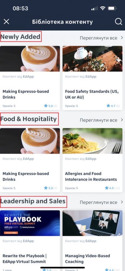
Some elements aren’t translated
Minor
Change the language settings to Ukrainian.
- Open the app.
- Go to “Courses”.
- Tap the “+” button.
iPhone 13, iOS 15.4.1
Some sections are in English.
Section titles should be displayed in the language selected in settings.
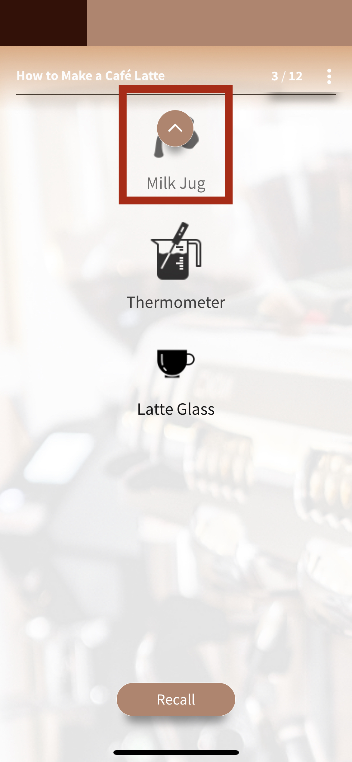
“Up” button covers some content
Minor
Add the course “Making Espresso-based Drinks”.
- Open the app.
- Go to “Courses”.
- Select the course “Making Espresso-based Drinks”.
- Start the “Cappuccino” course.
- Go to slide 3.
iPhone 13, iOS 15.4.1
The up button covers some content on the slide.
Buttons are properly positioned and don’t overlap content on slides.
“Up” button is shown as disabled yet tappable
Minor
Add the course “Making Espresso-based Drinks”.
- Open the app.
- Go to “Courses”.
- Select the course “Making Espresso-based Drinks”.
- Start the “Cappuccino” course.
- Go to slide 3.
- Tap in the “Up” button area.
iPhone 13, iOS 15.4.1
The button is shown as disabled, yet it works like the down button when tapped.
The button cannot be tapped if it is disabled.
Course page scrolls to top after exiting course overview
Minor
- Open the app.
- Go to “Courses”.
- Tap the “+” button.
- Scroll the course page to the very bottom
- Select any course.
- Tap the “back” button.
iPhone 13, iOS 15.4.1
The course page is displayed from the very beginning.
The scroll position on the page should not change.
EdApp is a mobile LMS that caters to the needs of modern users by giving them access to engaging micro-lessons no matter where they are. I conducted several types of tests and found issues with translation in different parts of the app, so I recommend putting more effort into localization testing. Another thing that concerns me is the app’s navigation. It wasn’t always intuitive and effortless, for example, when the back button was missing after starting a course. In some cases, an improper combination of font and background colors made reading content challenging. So usability testing should be prioritized to prevent these kinds of inconveniences for users.


