Bugs found in Chegg eReader
Chegg is a mobile ebook reader built to help users access their reading material at any time. This e-reader allows interconnectivity between multiple devices. You can also look for information in your favorite books by keyword search.
With the Chegg eReader, you can edit and highlight text in your ebook. The Chegg Math Solver provides users with answers to complex math equations by taking a quick snapshot. You can also create your studying flashcards with the Chegg Prep feature.
This app has the capability to assist students with their studies. So, we decided to check it out and share our detailed Chegg eReader bug report with you.
Flawed search bar function on the ‘Help’ page
Major
- Launch the app.
- Go to the ‘More’ tab.
- Tap the ‘Help’ menu item.
- Enter a valid search request inside the text input (e.g., Paper).
- Do not choose proposed questions > tap Submit.
iPhone XS, iOS 14.3
The last question proposed is opened automatically.
The entire questions list is shown on the page.
The ‘Back’ button is not activated after the first redirect from the main ‘Help’ page
Major
- Launch the app.
- Go to the ‘More’ tab.
- Tap the ‘Help’ menu item.
- Tap any item from the main page (e.g., Chegg Study).
- Pay attention to the back/forward buttons at the bottom of the page.
iPhone XS, iOS 14.3
The ‘Back’ button is still disabled.
The ‘Back’ button is activated and the user can go back to the main ‘Help’ page.
Invalid phone data is shown in the feedback
Major
- Launch the app.
- Go to the ‘More’ tab.
- Tap the ‘Give feedback’ menu item.
- Pay attention to the device info.
iPhone XS, iOS 14.3
The displayed device info does not match the parent device.
The displayed device info matches the parent device correctly.
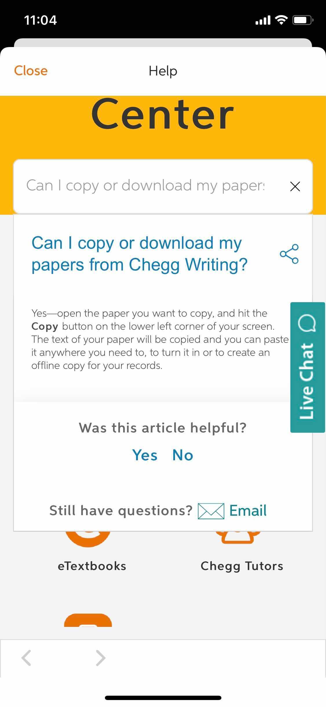
The opened search term overlaps with the main ‘Help’ page
Minor
- Launch the app.
- Go to the ‘More’ tab.
- Tap the ‘Help’ menu item.
- Enter a valid search term.
- Choose and tap one of the proposed items.
iPhone XS, iOS 14.3
The item with the answer overlaps with the main ‘Help’ page.
The item is opened on the page.
The ‘Back’ arrows have different positions when switching between pages
Minor
- Launch the app.
- Go to the ‘More’ tab.
- Tap the ‘About the app’ menu item.
- Tap ‘Privacy & Terms’ > Back.
- Tap ‘Licenses’ > Back.
- Pay attention to the position of the ‘Back’ arrow at the top.
iPhone XS, iOS 14.3
The arrow’s position changes.
The arrow stays in the same position.
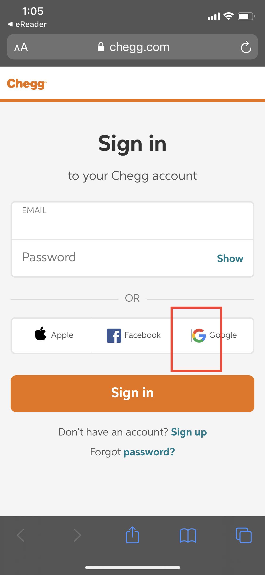
The Google icon is shown with a border on the left on ‘the Sign In’ page
Minor
- Launch the app.
- Go to the ‘More’ tab.
- Tap the ‘My Orders’ menu item.
- Pay attention to the social icons in the opened ‘Sign In’ page.
iPhone XS, iOS 14.3
The Google icon has a visible left border.
No visual issues are shown.
The titles are not centered in relation to the icons on the ‘Help’ page
Minor
- Launch the app.
- Go to the ‘More’ tab.
- Tap the ‘Help’ menu item.
- Pay attention to the icons and titles in the body.
iPhone XS, iOS 14.3
The titles are not centered in relation to the icons.
The icons and titles are centered in relation to each other.
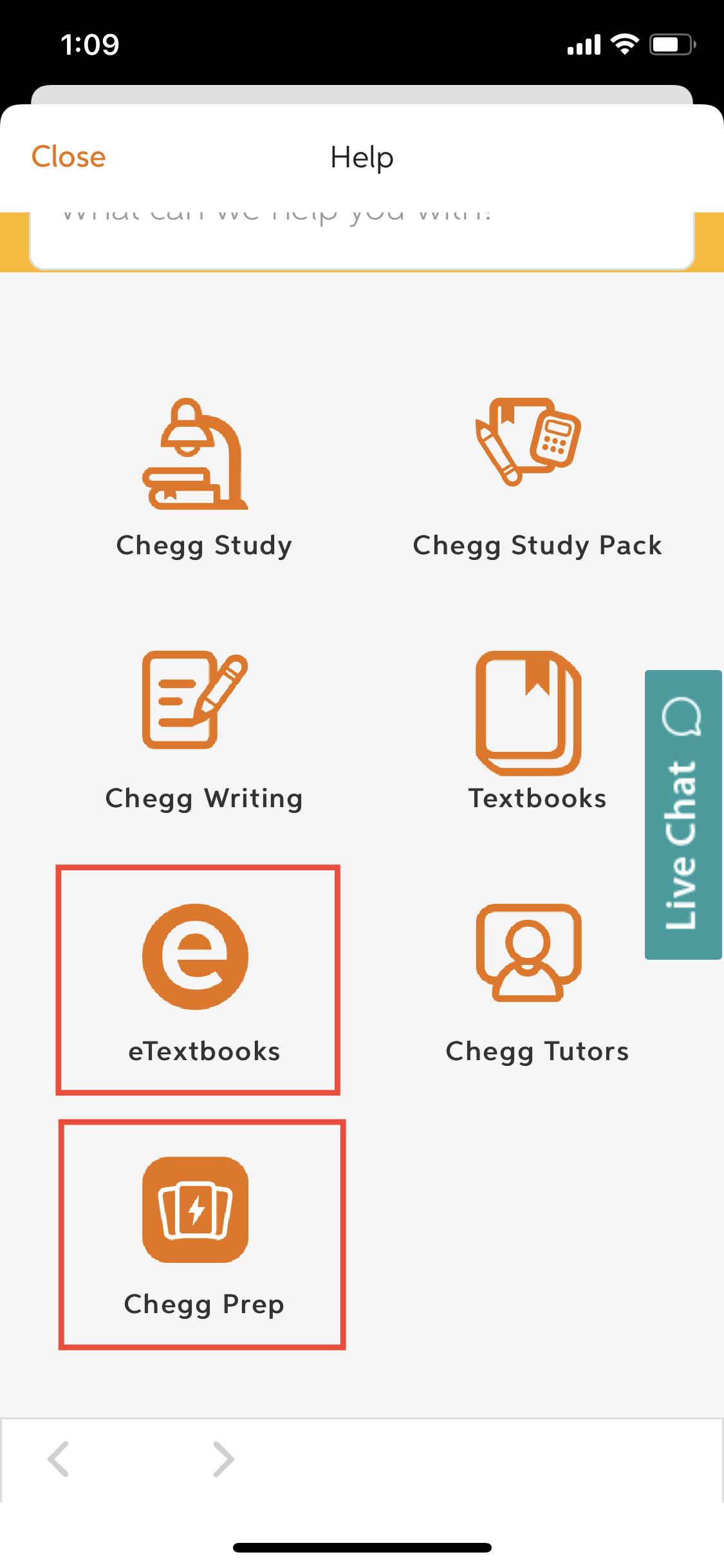
The app’s web view is full of UI issues. The ‘Back’ arrow doesn't have a fixed position and moves along the header. Also, the titles are not centered on the page. I hope they fix the UI issues on this app to improve the user experience.


