Bugs found in Yac for iOS
Yac is a voice messenger app for teams that aims to enhance performance and bring teams’ efficiency to a whole new level. The app allows you to keep the work within a team running without frequent group calls, offering async voice messages and screen sharing instead. The app’s core feature is enabling users to share their updates or inquiries without scheduling a meeting. Connect 1:1 or in groups; with a colleague, you share the same workspace or don’t even share the same timezone – both connections are equally accessible with Yac. What’s more, the app offers Slack & Zapier Integrations. Work more, meet less!
Considering the continually rising popularity of tools and solutions for remote workers, Yac has caught our attention. However, while testing the app, we came across some bugs, which interfere with the app’s performance.
The “Tap the Compose button bottom right to start a new message” isn’t fully displayed on the “Channel Messages” tab
Minor
- Launch the app.
- At the bottom of the screen, tap the “Channel Message” tab (the fourth icon).
- Pay attention to the sentence right below “No Channel Messages,” which is overlapped by the menu.
iPhone SE 1st gen + iOS 14.3
The “Tap the Compose button bottom right to start a new message” doesn’t display in full on the “Channel Messages” tab.
“Tap the Compose button bottom right to start a new message” is displayed in full on the “Channel Messages” tab.
“Action bar” is slightly shifted to the left, so the “Send Reaction” button isn’t displayed in full
Trivial
- Launch the app.
- Once the “Yac” homepage is loaded, tap the first message to pop up on the screen: “Say hello to your new connection on Yac!”
- Tap this message once again as the next step.
- Pay attention to the following result.
iPhone SE 1st gen + iOS 14.3
“Action bar” is slightly shifted to the left, so “Send Reaction” button isn’t displayed in full.
All the “Action bar” elements are centered and the “Send Reaction” icon is displayed in full.
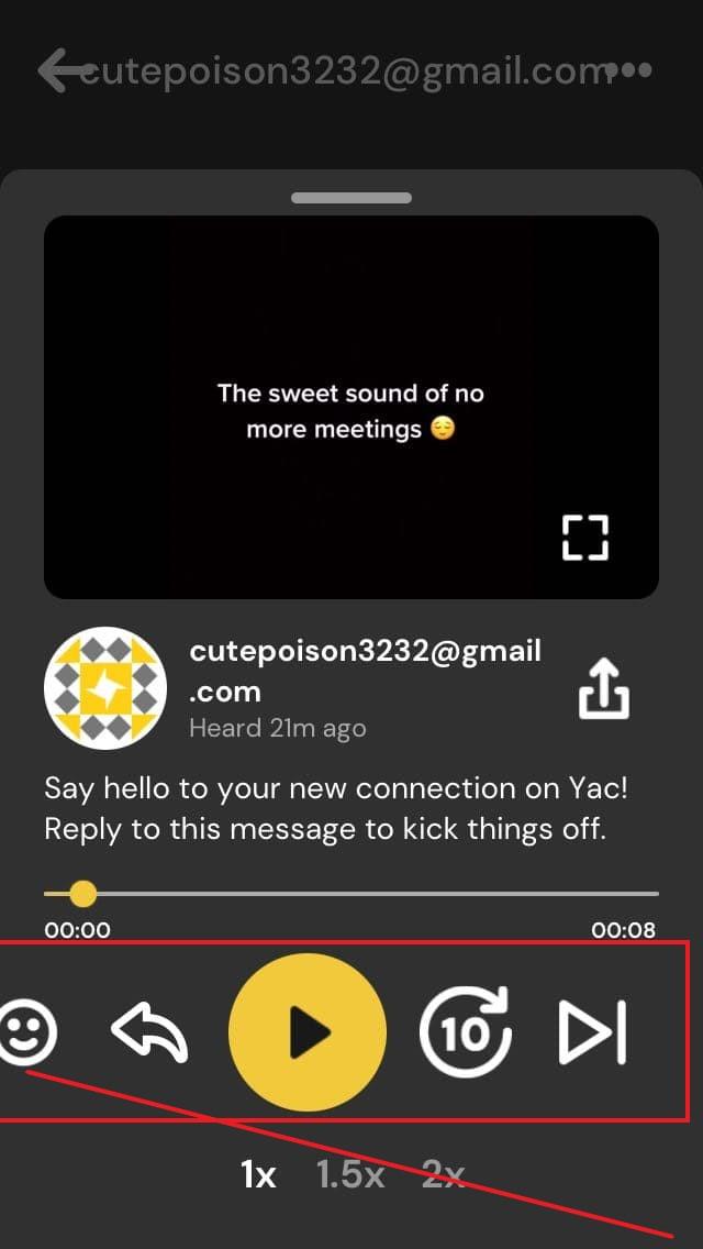
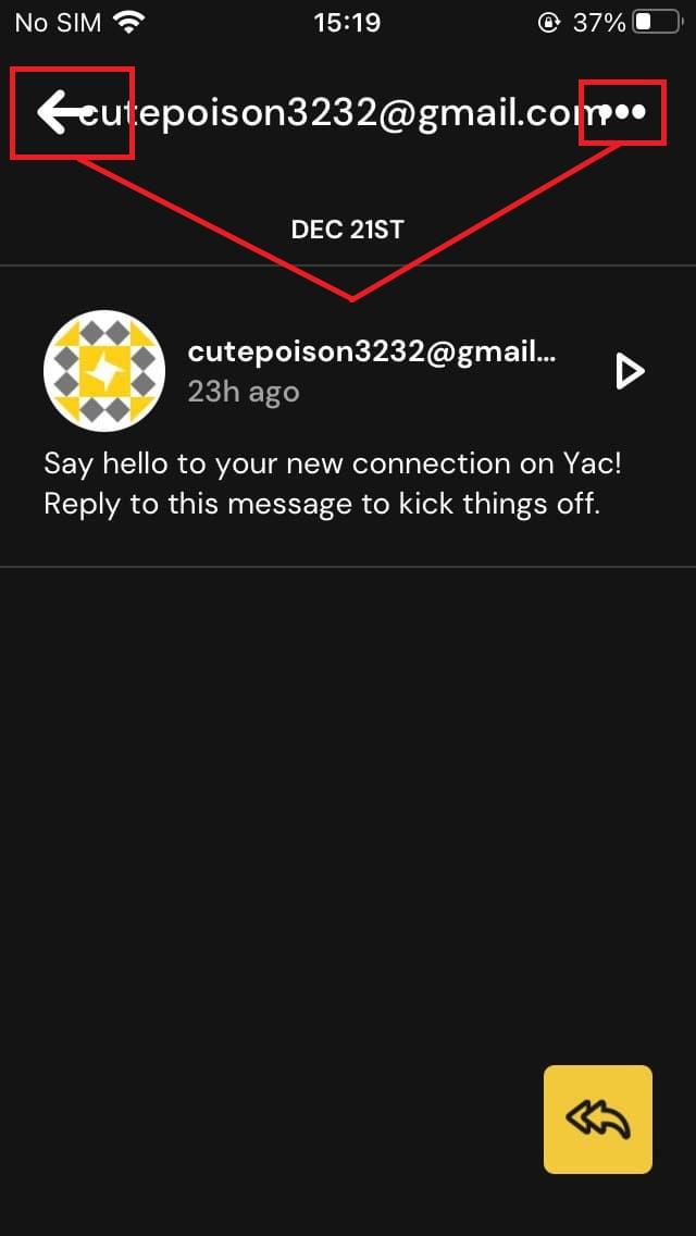
The email title is overlapped by “Left-arrow” and “More Option” icons on both sides
Trivial
- Launch the app.
- Once the “Yac” homepage is loaded, tap the first message to pop up on the screen: “Say hello to your new connection on Yac!”
- Pay attention to the following result.
iPhone SE 1st gen + iOS 14.3
The email title is overlapped by “Left-arrow” and “More Option” icons on both sides after tapping the first message on the home screen.
“Left-arrow” and “More Option” icons do not overlap the Email title.
Yac is an audio first messenger for teams. With Yac, it is as simple as ABC for teammates to stay in sync without being hindered by meetings. The overall impression is satisfying. Certainly, low-impact UI inaccuracies may worsen user experience, but major application features work as expected.


